
You may have five “brown lenses” in your drawer, yet every selfie looks different. Some look super natural, while others suddenly give you a full doll-eye vibe. The difference isn’t the color itself, but the pattern, graphic diameter, and edge design.
브라운 렌즈만 서랍에 5종 있는데, 셀카를 찍어보면 어떤 건 되게 자연스럽고, 어떤 건 갑자기 인형 눈처럼 느껴질 때가 있다. 이 차이를 만드는 건 색이 아니라 패턴과 그래픽 직경, 엣지 디자인이다.
1. Four Key Elements of Lens Design
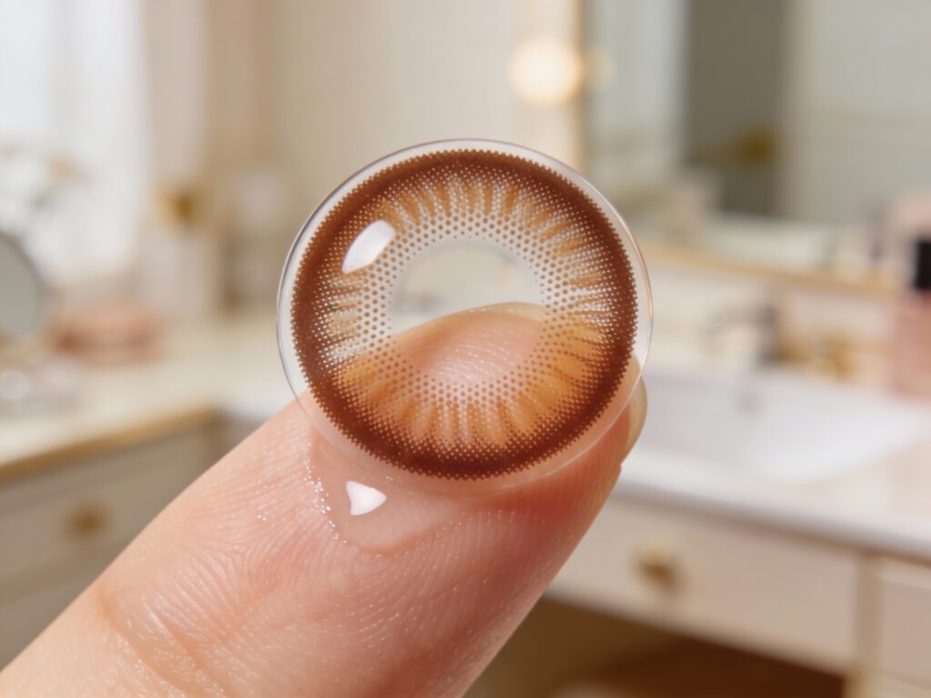
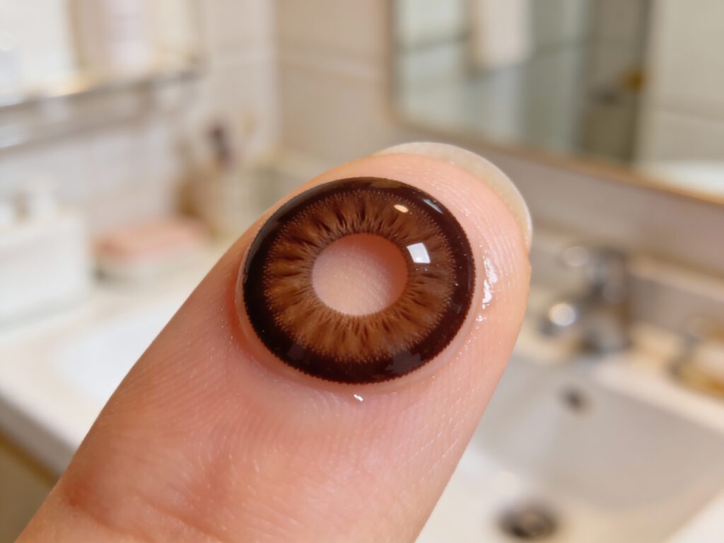
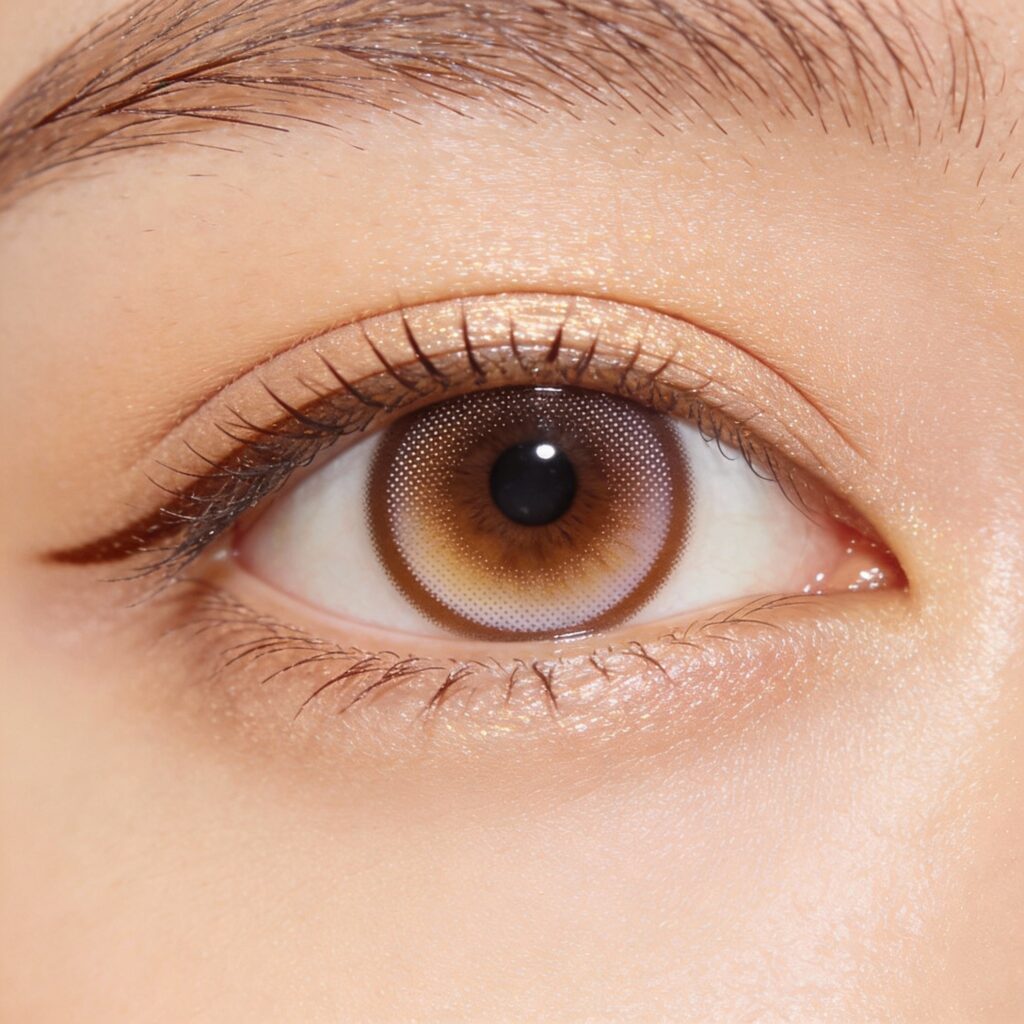
1) Graphic Diameter (GD)
-
Meaning: The diameter of the actual printed/patterned area, not the total lens size.
-
Rough feel:
-
Around 13.0 mm: Almost like your own eyes, very natural, “no-lens girlfriend lens” mood.
-
13.3–13.6 mm: Sweet spot for daily wear; the iris looks clearer and slightly bigger.
-
13.7 mm+: Eyes look much larger, but without makeup it can look obviously “lens-y.”
-
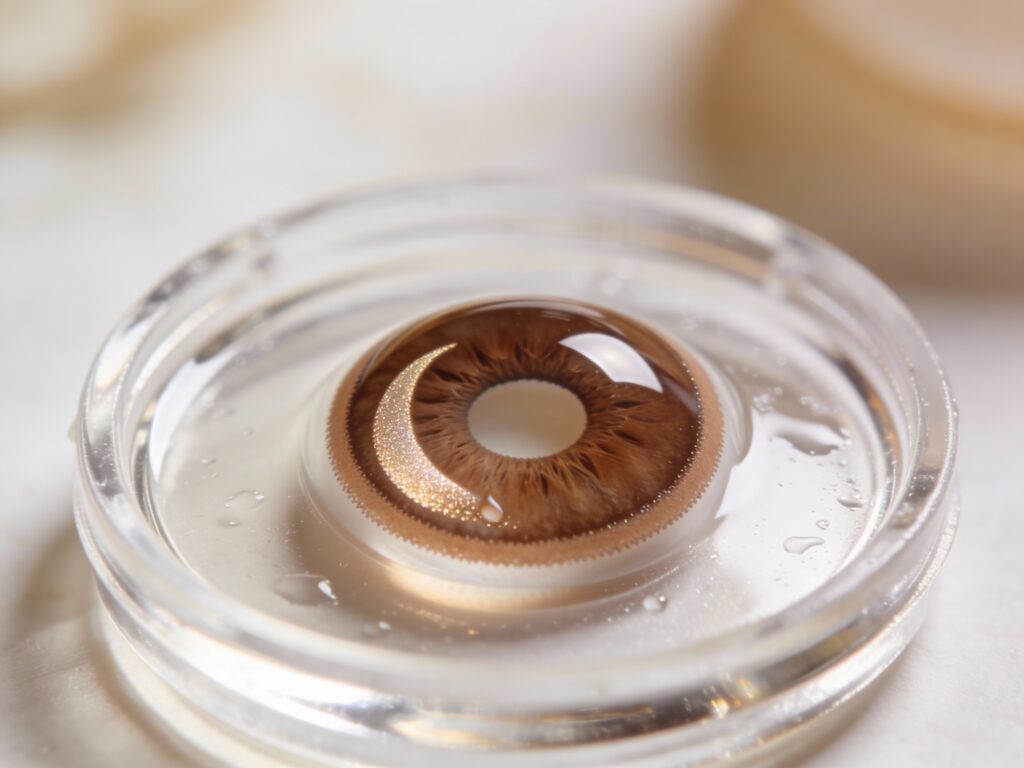
2) Pattern (Print)
-
Dot pattern: Tiny dots forming the color and gradient. Close up you can see the dots; from a distance it becomes a smooth blend.
-
Line pattern: Radial lines from the center outward, giving the iris a clear “texture line.” Very defined, but can look artificial if overdone.
-
Highlight pattern: A lighter “crescent” or highlight area built into the print to mimic light reflection and watery eyes. Many “tear‑gloss / dewy eye” lenses use this structure.
3) Edge (Outline)
-
Bold circle line: Thick, dark ring around the iris. Makes eyes look much bigger and sharper, but can feel too strong with bare skin.
-
Blurred edge: Soft, diffused rim that extends your natural iris rather than drawing a harsh border.
-
No-circle (edge-less): Almost no visible rim; only the inner color changes slightly. You have to look closely to notice the lens at all.
4) Number of Tones (One/Two/Three-tone)
-
One-tone: Single, flat color. Simple and neat, but can lack depth.
-
Two-tone: Typically darker outside and lighter toward the center, or vice versa. Creates a natural gradient transition between pupil and iris.
-
Three-tone: Base color + highlight + outer ring combined for 3D depth. When done well, it looks very natural; when overdone, it can look like obvious “printed eyes.”
1. 렌즈 디자인, 이 네 가지가 핵심
1) 그래픽 직경 (GD)
-
의미: 색이나 패턴이 들어간 실제 컬러 부분의 지름. 전체 직경(DIA)과 다르다.
-
느낌:
-
13.0mm 안팎: 거의 내 눈처럼 자연, “안 낀 듯한 여친렌즈” 느낌.
-
13.3~13.6mm: 데일리용으로 가장 무난, 눈동자 또렷.
-
13.7mm 이상: 확실히 커 보이지만, 메이크업 없으면 렌즈 낀 티가 난다.
-
2) 패턴(무늬)
-
도트 패턴: 작은 점들이 모여 있는 타입. 가까이서 보면 점점이, 멀리서 보면 자연스러운 그라데이션.
-
라인 패턴: 선이 방사형으로 퍼져 있어서 눈동자에 선명한 결이 생김. 또렷하지만 자칫 인위적일 수 있다.
-
하이라이트 패턴: 동공 한쪽에 밝은 영역이 있어, 빛 받은 것처럼 보이게 하는 디자인. 요즘 ‘물먹’·‘울먹’ 렌즈 대부분이 이 구조를 쓴다.
3) 엣지(테두리)
-
진한 서클 라인: 눈동자 테두리가 또렷, 눈 크기가 확 커 보인다. 대신 민낯에는 과한 느낌이 나기 쉽다.
-
블러 엣지(번진 테두리): 경계가 살짝 흐려져서 원래 눈 크기처럼 자연스럽게 확장되는 느낌.
-
노 서클(무테): 테두리가 거의 없어, 컬러만 살짝 더해지는 타입. 아주 가까이에서 봐야 렌즈 낀 걸 알 수 있다.
4) 톤 수 (원톤/투톤/쓰리톤)
-
원톤: 한 가지 색으로만 채워진 패턴. 단순·깔끔하지만 깊이가 덜할 수 있다.
-
투톤: 바깥은 진하고 안쪽은 밝게, 혹은 반대로. 자연스러운 그라데이션으로 동공과 홍채 사이를 부드럽게 연결해 준다.
-
쓰리톤: 기본 컬러 + 하이라이트 + 자연스러운 외곽을 섞어 입체감을 만드는 타입. 잘 만들면 정말 자연스럽지만, 과하면 “이물감 있는 눈”이 된다.
2. How Different Patterns Change Your Impression
1) Bold Circle Pattern – Doll-like Definition
-
Features: Thick circle line + relatively large graphic diameter.
-
Impression:
-
Very defined, big “doll eyes,” strong presence in photos, video, and under stage lighting.
-
Can look unnatural with no makeup; the lens is clearly noticeable close up.
-
-
Best for:
-
People who regularly wear eyeliner and mascara.
-
Those who film content or take lots of selfies and don’t mind an obvious lens look.
-
2) Gradient / Two-Tone Pattern – Classic Girlfriend Lens
-
Features: Dot-based gradient where the outer ring is darker and gently fades inward.
-
Impression:
-
Soft boundary that makes you look like you were born with slightly bigger eyes.
-
Works well with both bare skin and everyday makeup.
-
-
Best for:
-
Anyone wanting that “girlfriend/boyfriend lens” vibe with low detection.
-
Office, campus, and general daily wear.
-
3) Highlight / “Tear-Gloss” Pattern – Dewy Idol Mood
-
Features: Lighter zone around part of the iris to imitate light reflection.
-
Impression:
-
Eyes look glossy, dewy, and emotional, like they’re slightly teary.
-
Looks especially pretty under sunlight, indoor lighting, and camera flash.
-
-
Best for:
-
Dates, events, concerts, or any “today I want to look special” moment.
-
Works best with at least light base makeup + blush + lip.
-
2. 패턴별로 달라지는 인상
1) “서클 선명” 패턴 – 인형 같은 또렷함
-
특징: 굵은 서클 라인 + 비교적 큰 그래픽 직경.
-
인상:
-
눈알이 또렷, 사진·무대·파티에서 존재감 강함.
-
노메이크업에는 어색할 수 있고, 가까이서 보면 렌즈 느낌이 뚜렷.
-
-
어울리는 사람:
-
아이라인·마스카라를 평소에 잘하는 사람.
-
셀카/영상 촬영이 많고, 렌즈 낀 티 나는 걸 괜찮아하는 타입.
-
2) “그라데이션·투톤” 패턴 – 자연스러운 여친렌즈의 정석
-
특징: 바깥은 진하고 안쪽으로 갈수록 점점 옅어지는 도트 패턴.
-
인상:
-
눈동자 경계가 부드러워 원래 눈이 큰 사람처럼 보인다.
-
쌩얼·데일리 메이크업 모두와 잘 어울린다.
-
-
어울리는 사람:
-
여친·남친 렌즈 느낌, 티 안 나는 인상을 원하는 사람.
-
직장·학교에서 데일리로 쓰고 싶은 사람.
-
3) “하이라이트·물먹” 패턴 – 울먹, 아이돌 감성
-
특징: 동공 주변이나 한쪽에 밝은 컬러를 넣어 빛 반사처럼 보이게 한 구조.
-
인상:
-
눈동자가 그렁그렁, 촉촉해 보이는 효과.
-
조명·햇빛·플래시를 받을 때 특히 예쁘게 나온다.
-
-
어울리는 사람:
-
셀카, 데이트, 공연·축제 등 “오늘은 좀 특별하게” 분위기를 내고 싶은 날.
-
민낯보다는 톤업 베이스 + 블러셔 + 립 정도는 한 상태.
-
3. Graphic Diameter: How a 0.1 mm Change Alters the Mood
Even with the same color and pattern, changing the graphic diameter by just 0.1 mm can noticeably change your vibe.
-
Around 13.0 mm:
-
“Did you do something? You just look more awake” level.
-
Safe for conservative environments like offices, internships, and interviews.
-
-
Around 13.3 mm:
-
The sweet spot for most “girlfriend lenses.”
-
Looks fine bare-faced and really good with simple makeup in photos.
-
-
Around 13.6 mm:
-
Lens effect clearly shows.
-
Needs some eye makeup to balance the proportions.
-
-
13.8–14.0 mm+ (graphic):
-
Combined with strong circle lines, it creates a full doll-eye effect.
-
Great for parties, stage, and photoshoots; more polarizing for everyday wear.
-
3. 그래픽 직경, 0.1mm 차이로 달라지는 눈 분위기
같은 패턴·같은 컬러라도 **그래픽 직경(GD)**이 0.1mm만 달라져도 인상이 꽤 달라진다.
-
13.0mm 근처:
-
“원래 눈인데 좀 또렷해졌나?” 수준.
-
직장·인턴·면접 같은 곳에서도 부담 없다.
-
-
13.3mm 전후:
-
대부분의 여친렌즈 포지션.
-
쌩얼에도 괜찮고, 메이크업하면 사진에서 눈이 잘 산다.
-
-
13.6mm 전후:
-
확실히 렌즈 느낌이 살아난다.
-
아이 메이크업을 같이 해야 비율이 맞다.
-
-
13.8~14.0mm 이상:
-
서클·강한 패턴과 만나면 인형 눈.
-
파티, 공연, 사진 촬영용으론 좋지만, 데일리엔 호불호가 갈린다.
-
One-Line Summary
Even with the same brown color, changing the pattern and graphic diameter gives you completely different eyes.
From now on, instead of only asking “Which color should I buy?”, try asking:
“Which pattern and graphic diameter really fit my lifestyle and face?”
That’s the key to smart lens shopping in 2026.
한 줄 정리
같은 브라운이라도, 패턴과 그래픽 직경이 달라지면 “완전 다른 사람 눈”이 된다.
이제는 “무슨 색을 살까?”보다
“내 라이프스타일에는 어떤 패턴과 그래픽 직경이 맞을까?”를 먼저 떠올려 보는 게, 2026년 렌즈 쇼핑의 포인트다.